Texture from Latin textura “web, texture, structure,” from stem of texere “to weave”
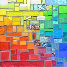
Texture delights my hand as well as my hands. This mosaic was slow to start until I picked up the thread of texture in the glass and pieces that hadn’t found a place in other other work seemed made for this. The etymology of texture connects it to weaving and although I’ve imagined mosaic as a kind of quilting, weaving is also apt.
In grade school, an artist came to show us how to make a simple wooden loom and weave with fibers in many textures: twisted strands, knobby yarns, and fluffy wool roving. I loved the process. A house fire when I was 18 damaged many possessions but this weaving was one that I missed the most. The main of it stayed with me though, the process of creating.
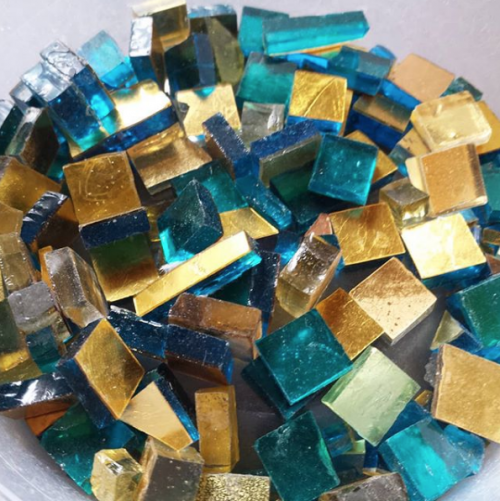
One of my favorite materials is gold smalti: a chunk of glass plus a thin layer of gold and an even thinner layer of glass on top. This luscious dish of smalti was made by the Orsoni Factory in Italy, and I buy it by the ounce, even though I covet it by the ton. Someone asked me if this is the gold used in the ceiling of San Marco in Venice. I looked it up, and Orsoni has since its beginning in 1888, manufactured mosaics for the renovation of the Basilica. It supplied more than 1,000 ancient 24K gold plates that decorate the 8,000 square meters of the structure.
Closet of Glass. Photo by Margaret Almon.Orange Millefiori. Photo by Margaret Almon.
Part of being an artist is being surrounded by my materials, and my art unfolding from their inspiration. Our surroundings may bear the imprint of our aesthetic passions. A friend, Ivan Chan, once shared a photo of a chest of drawers he described as part card catalog, part Chinese apothecary cabinet, which caught my eye. Perhaps part of my attraction to the librarian profession was my love of libraries as a place, and the fantastic furniture of knowledge embodied in a card catalog. At University of Illinois in Urbana-Champaign, the main library card catalog lined the hallways. The drawers glided out, and with the right motion could be unhooked and rested on a sliding panel tucked into the center of each cabinet.
Top Drawer of Tower of Tesserae: Orange Gold Smalti. Photo by Margaret Almon.
Ivan is an artist and a psychotherapist, and a print of his, Here Kitty, watches over my studio. The aesthetics of a psychotherapist office having a role in guiding him to the profession echoes what I felt about libraries and now with my studio. The time I spent in such offices contributed to the possibility of creating art, to taking my love of color and creation seriously.
Second Drawer in the Tower of Tesserae. Photo by Margaret Almon.Third Drawer in the Tower of Tesserae. Photo by Margaret Almon.
What surroundings are you drawn to? Is your profession or passion connected to a certain place and aesthetic?
Prismacolors in Yellow to Orange from the Box of 150. Photo by Wayne Stratz.
Due to the kindness of family birthday gift certificates, Stratoz broke open a box of 150 Prismacolors, and also did an inventory of the ones he already had, in various states of stubbiness. The smallest ones, often consisting mostly of the color name and nothing more, will go to the school with him for student drawing. The new ones have both English and French color/colour names, and a friend noted that the French names will be the last remaining ones after sharpening, and very elegant. There are a few new oranges, which pleased me: Cadmium Orange Hue, Deco Peach, and Neon Orange.
Prismacolors On the Drawing Board in Stratoz’s Studio. Photo by Wayne Stratz.
When I met Stratoz, he was already a doodler, and Prismacolors became an important part of his designs, with their blend-able nature. Several years later, I took a workshop on drawing mandalas on black paper with white and colored pencils, and was pleased to get my own set. When I was in junior high, I remember getting a booklet promoting a contest by Canada’s Laurentian pencil crayons, with elaborate example drawings. I would study it, imagining what I could draw, though I never did enter the contest. I had decided I wasn’t an artist.
Laurentien Colored Pencils Commodore 64 sweepstakes! By John Redpath. The contest closed August 1985.
I looked up Laurentian, and was sad to see they were bought up in some pencil crayon merger of the Century, first to Sanford(who makes Prismacolors!) and then Newell-Rubbermaid, who appeared to discontinue or change the formula. The internet is echoes with the refrains of those who are looking for Laurentians (or Laurentiens as they were later spelled). I also discovered that “pencil crayon” is a remnant of my Canadian past, and in the US the “colored pencil” is more common. Stratoz calls them “art pencils” which indeed they are.
UPDATE: I wish I could have actual Laurentians, but it was satisfying to work 2 puzzles from a rainbow color series by Canadian artist Shelley Davies, which have Laurentians worked into the collages.
Today I am sharing blog space with Michelle Francl-Donnay. Michelle found Stratoz’s blog, because she too was going to Wernersville Jesuit Center for a silent retreat. I met Michelle in 2008, when she came to one of our craft shows. She wanted to meet us, and ended up smitten with my Spiral Mandala, and purchased it for her prayer space. She is a delightful combination of Ignatian spirituality, thoughtful writing, and Professor of Chemistry. Be sure to check her out at Quantum Theology, and see the pure awesomeness of her photo mosaic of Marie Curie, composed of 270 female scientists.
Gold nanoparticles, from Wikimedia and used under a Creative Commons license.
Red Dwarfs
I want to thank Margaret for her invitation to visit her blog and talk
about chemistry and color. I have a gorgeous mosaic by Margaret
hanging on my wall — deep blues and golds spiraling inward. I
love Margaret’s art, but I also enjoy her poetry. She’s writing about
Marie Curie, in poetry and prose over at my blog today. Do come visit Marie and Margaret there!
If you see a colored compound in chemistry, you can almost bet that it
will contain a transition metal. Though we think of metals as being a
shiny grey hue (with a few exceptions, gold being one), metals are key
to color, particulary in art. The visible frequencies of light are
relatively low in energy, and correspond to the small gaps in energy
that electrons can leap in metals (what chemists call d to d
transitions). Cobalt blue, one of my favorite hues, is (as its name
suggests) a cobalt salt: CoAl2O4.
To get different colors, you have to use different metal salts. You can get
a brilliant yellow using lead chromate, the same chrome
yellow that Vincent Van Gogh used. Tweaking colors to get
slightly different hues requires either mixing materials or finding a
different salt altogether, the gaps that the electrons leap over when
they absorb light aren’t adjustable.
But there are other ways to create color using metals. Red stained
glass has been made for centuries by adding gold to molten glass and
carefully controlling the temperature. The gold clusters together in
small particles which then become evenly distributed and suspended in
the glass.
These tiny clusters are called nanoparticles, because they are 100
nanometers or less in size. One nanometer is 1 billionth of a meter,
the period in this sentence is about a million nanometers across, the
little gold balls in red glass are about 25 nanometers in diameter.
The prefix nano, comes from the Greek word for “dwarf,” hence the
title of this post. Nanoscience is older than you think!
The gold nanoparticles are not dissolved in the glass, but form a
colloid. And one property of colloids is that they scatter light.
Different frequencies of light scatter differently, which is why the
sky is blue, though the scattering of light by a colloid is a slightly
different process. (Scattering isn’t the only process involved in the
color, but unless you really want to fly off the math cliff with me,
let’s leave talk of quantum dots and wavefunctions to another day.)
The color of light that a colloid scatters depends on the size and
shapes of the particles dispersed. It turns out just by varying the
size and shape of the particles involved you can tune your gold
nanoparticles to be red, red-violet or even green and many colors in
between!
If you are interested in knowing more about the history and chemistry
of color, Bright Earth: Art and the Invention of Color by Philip
Ball is a terrific introduction. For a readable introduction to
nanoparticles, quantum dots and color, try this
article in the NY Times.
The
photo is from Wikimedia and used under a Creative Commons license.
Grout is the mysterious element of making mosaics. Grout can unite the pieces or make them stand apart. The word Grout may come from the Old English “gruta” meaning coarse meal, a kind of porridge. Grout fills in the spaces, as if a sustaining porridge, yet has no adhesive quality in and of itself. Grout obscures the surface when applied, but then helps reveal the ultimate beauty of the glass. Grout is why I spend so much time in hardware stores. Grout is the fuel of my friend Joanne, The Grout Monster, who loves to grout as a healing process of playing in the mud. Joanne is in the middle of her 2012 Poet Laureate of Montgomery County program, and for the month of April, National Poetry Month, I give a shout out to Joanne Leva, Grout Monster and poet extraordinaire.
Fruit of the Spirit Mobile by Margaret Almon(Age 12)
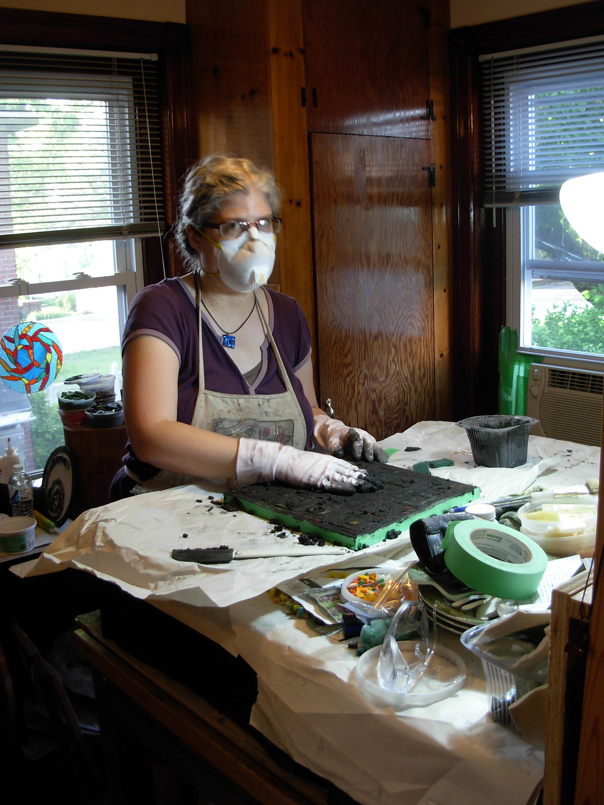
When I wrote earlier about my Fruit of the Spirit Mobile that I painstakingly stitched from polyester double knit, my mother emailed this photo to me, as she has it hanging in her dining room. I had forgotten how pleased I was with the pineapple of Goodness, and the plaid on a diagonal for texture! Self-Control is emblazoned a banana, my least favorite fruit, but I still enjoyed the curve. I may have had a jumper made of the pale peach of Self-Control, and the vibrant orange of Kindness is where my eye goes to now. Seeing it all in the flesh(fruit-flesh that is), brings back the tactile sense of making the stitches, lining up the fabric. This part of the root system that led to my life now as an artist, and my new manifestation of the Fruit of the Spirit via the commission from Suzanne Halstead. On Wednesday, Suzanne and I grouted Faithfulness and Kindness. The scale is much larger than my mobile, as is my excitement in seeing it all bear fruit! More photos to come as the process continues.
Margaret Almon and Suzanne Halstead Grouting Faithfulness and Kindness


