![]()
You can’t go wrong with stop motion video, OK Go and color mixing.
![]()
You can’t go wrong with stop motion video, OK Go and color mixing.
![]()
Orange light may help us wake up like a cup of coffee. A 2014 study by Gilles Vandewalle has the poetic conclusion that, ” A burst of orange light wakes up our ‘circadian eye.'” Orange is awesome.
![]()
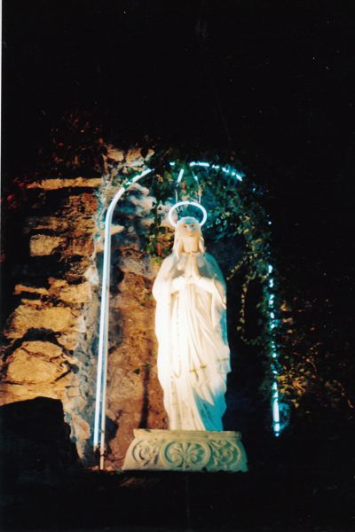
The first time we witnessed the Blue Neon Madonna(not her real name), Stratoz and I were startled. She has a blue mantle of other-worldliness. Another favorite neon was Electronic Superhighway by Nam June Paik.

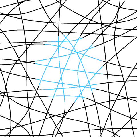
Neon signs combine glass tubes with inert gases and electrification to create a gorgeous glow. I love neon signs, but neon paint never appealed to me, and in investigating what makes a color “neon,” I discovered that it’s the addition of substances that show up under UV or black light. The paint will reflect back more light than expected. I also discovered the illusion of neon color spreading, where colored lines in the midst of black lines take on a glow like a neon sign.
When I saw Simon Garfield’s book on the color mauve, I checked it out of the library immediately. I wasn’t a mauve enthusiast, but the idea of a whole book about one color was intriguing. William Perkin(1838-1907) was experimenting with coal tar, in hopes of finding a cure for malaria, but instead noticed an intense purple color in his beaker. Perkin pursued the manufacture of mauve, a world awash in shifting purple pinks.

Because it is also Orange Tuesday, I will mention another coal tar dye called Methyl Orange. It changes color, from red in acid, to yellow in base.
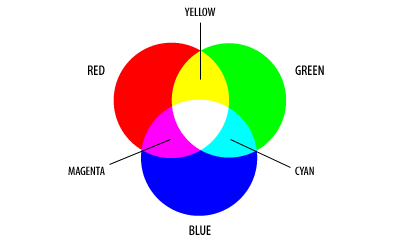
Mixing primary color paint is an ingrained memory from elementary school. Mixing light is much less familiar, and watching this video was a bit unnerving. If you mix red and green light, our brains will interpret it as yellow light. I was staggered by the complexity of interpretation on the part of the brain, creating many colors with of just three types of light receptors: red, green, and blue.
![]()
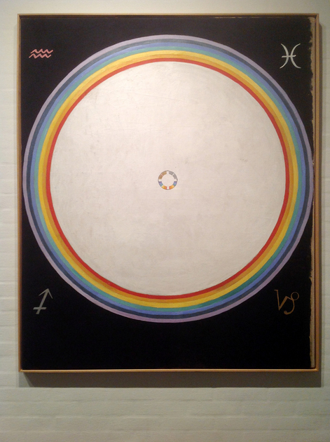
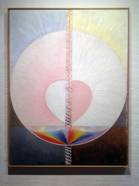
Hilma af Klint(1862-1944), was of the first generation of Swedish women allowed into Sweden’s art schools. She discovered spiritualism and attributed her paintings to a higher consciousness working through her, and she and four of her friends were influenced by Theosophy and Rudolf Steiner. I discovered this in the middle of reading Rudolf Steiner’s book on color theory.
Some of her spiritual paintings were first shown the exhibition, The Spiritual in Art: Abstract Painting 1890-1985 at LACMA Los Angeles 1986, along with famous painters such as Kandinsky and Mondrian, but Hilma af Klint was out of the loop of the art world, with her paintings. In a way she reminds me of Albert Barnes and his Barnes Foundation, in her guarding of her work, which cannot be sold, only released to institutions in order to support her archive. Because she has no collectors and is not part of the marketplace, it’s like her work became immaterial.
Hilma af Klint: A Paintings for the Future Painters’ Table
Includes 20 minute video on af Klint’s work.
Kopenhagen Magasin with many images of af Klint’s work.
![]()

")

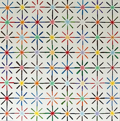
Stratoz was pleased to find a J for me, Alfred Jensen(1903-1981), since his jazz doodle was set to Christine and Ingrid Jensen. Alfred Jensen incorporated diagrams, numerical systems, textiles from Guatemala, and the color theory of Goethe into his paintings. His work contains both the mandala like circular forms and quilt patterning that I am drawn to in my own work.
![]()

I found a copy of Johannes Itten’s book The Art of Color at a rummage sale. Itten was a Swiss Expressionist painter influential on artists of the Bauhaus.
Itten taught about color in the face of the belief that either you were good with color or you were not.
Most instructive was Itten’s statement that, “A color is always to be seen in relation to its surroundings.” Colors shift according to their neighbors and to the light. Itten describes a mausoleum in Ravenna with blue mosaic walls, and narrow windows of orange tinted alabaster. Orange and blue are complements which means they mix into gray, and Itten says the light in the mausoleum is a magical gray, with the walls reflecting blue and orange depending on the angles.
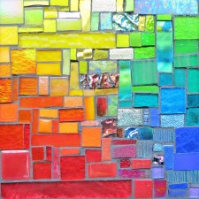
I appreciate his assertion that mosaic art places “high demands on coloristic powers” with each fragment acting in relation to many others.
![]()
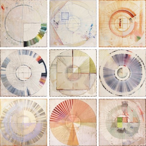
Ellen Heck is a fine art printmaker living in the San Francisco Bay Area, and these color wheels are a visual journal of the colors of her landscape. These appeal to my librarian and artist senses, with the organizing of ideas in a visual classification. There are times when the artifacts of creating art are as appealing as the finished piece, and imbue it with their own qualities.
![]()
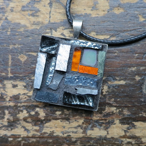
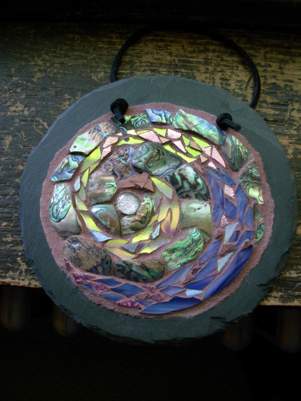
When I met Stratoz, he said his favorite color was gray. He still digs it. He’s also doing an A to Z challenge, doodling his way through the alphabet with jazz on the stereo. Since it’s Orange Tuesday, I also include this photo of a gray pendant I created with a dash of orange.