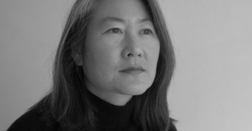
Margaret Taylor Burroughs(1915-2010), was a founder of the DuSable Museum of African American History, as well as the South Side Community Arts Center(SSCA) in Chicago when only 23 years old. There were no galleries in downtown Chicago for African-Americans to exhibit their art, or gather together in the 1930’s. With the New Deal, Roosevelt’s WPA Arts Project provided funding to open the SSCA. In an echo of 2017, Burroughs writes:
As we progressed further into 1943, it became more and more evident that the art center would no longer receive WPA funds to pay for its salaries or operations. Reactionary congressmen wiped out all of the social and culture programs. Efforts were made to build a membership which would contribute annually to the center’s support. Pauline Kigh Reed organized a committee of 100 women to help to raise funds.(Chicago’s South Side Arts Center: A Personal Recollection)
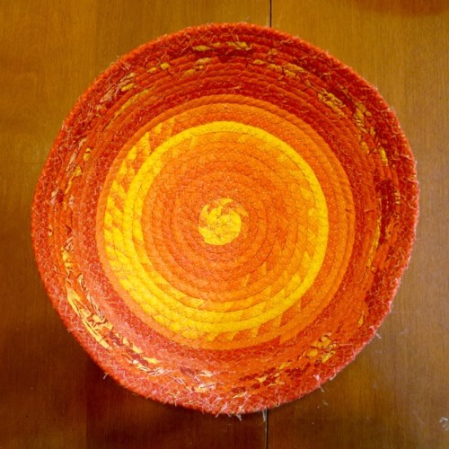
Burroughs was a printmaker, and one of her color prints caught my eye.
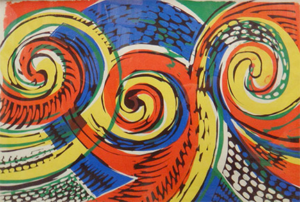
Spirals, 1985
Linocut
Koehnline Museum of Art
Gift of Mr. & Mrs. Harlan J. Berk, 2013.55
Her black and white linocuts have the bold power of contrast, and in Sleeping Boy, I see an echo of a spiral as well.
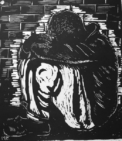
Sleeping Boy, 1990s
Linocut
Koehnline Museum of Art.
Gift of Dr. Margaret Burroughs, 2008.15
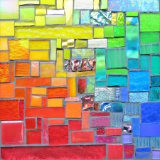
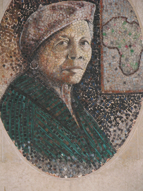
In the serendipity that comes with researching Margarets for Margaret Mondays, I discovered a mosaic portrait of Burroughs by Thomas Miller(1920-2012), graphic designer and visual artist. The DuSable Museum commissioned Miller to do portraits of the founders, in a unique style:
The founders’ murals are Miller’s magnum opus, and beautifully demonstrate the creativity that is typical of his work. Unlike traditional mosaic that is made with earthenware or glass tile, these are made from thousands of pieces of plastic that were harvested from plastic egg crate light diffusers which were then individually colored and arranged to create the images in the series. “Anybody can do an oil painting,” he said during an interview, “but to take a face and do it with squares is hard. They have to be turned at an angle to catch the light”. (Interview with Lauren Fitzpatrick)
He was fascinated by art from a young age, and read all he could at libraries. After serving in the Army in WWII, he enrolled in a Commercial Art Program at the Ray Vogue School of Art in Chicago. Finding a graphic design firm that would hire an African-American was hard. One agency said they would offer him a job if he worked behind a screen. He declined the offer. Morton Goldsholl hired him the 1950’s, and he went on to do the logo rebrand of 7 Up in 1975. Check it out. I like how it resembles a mosaic.
