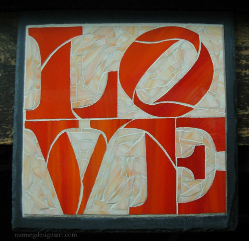
The client came over to pick up her mosaic, and was very happy, which makes me happy! The Love sign is a motif in her home. Stratoz had done his studying of the font, choosing cut-lines, cutting, grinding and gluing down the pieces of LOVE. I was then faced with how to flow around these formidable letters. Working with Robert Indiana’s configuration at close range made me appreciate the shapes emerging from the spaces, particularly the arrow formed between the L and the V, and his tilted O is awesome. Stratoz lined up the grain of the stained glass streaks to tilt as well.
I was reminded of Home Ec class, and learning to find the grain of woven fabric and aligning the pattern pieces to allow a skirt to hang straight, or placing pieces that on the diagonal, to make bias tape, which gives into the stretchiness of the angles. The root of the word bias means “slant, slope or oblique,” and the O is caught just as it begins to roll. Letters are expressive in their shapes, and we absorb their delight as we are reading.


How beautiful! It reminded you of bias in your home ex class, and it reminds me of a pillow I appliquéd in sewing!
Thank you Snowcatcher! Applique always seemed a mystery to me, how the stitches were almost invisible.
Very lovely!
♥ aquariann
Featured Photo: Fuchsia Flower
Thank you aquariann! The fuschia in your photo is wonderful. I’d love glass in that color.
thanks for describing a little of the detail here.