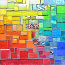
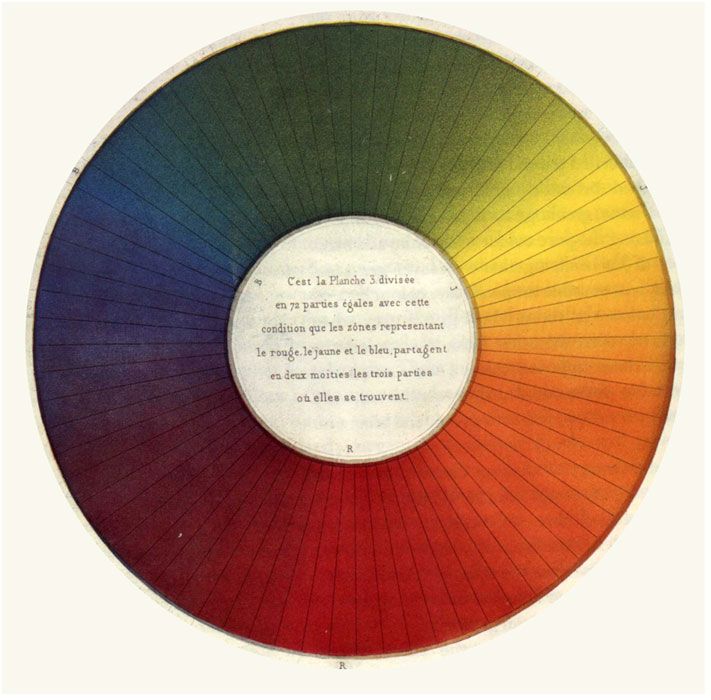
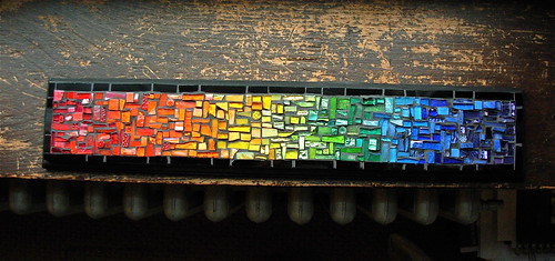
Discovering ways to work with color was pivotal in making my art. The first time I saw a color wheel I fell in love. Then in 2004, I read Nita Leland’s book Exploring Color which was like an infusion of pure energy. I was reminded of my color wheel love when I made the Rainbow Panel for the exhibit at Virago Baking Company, with all the delicious transitions between colors, and then Stratoz mentioned he was teaching about Maurice-Eugene Chevreul in his science class. Chevreul was a chemist hired by the Gobelin Dyeworks of Paris to brighten up their colors. What’s fascinating is his conclusion that the dyes themselves weren’t the problem, but how close together the different colors were woven together by textile companies.
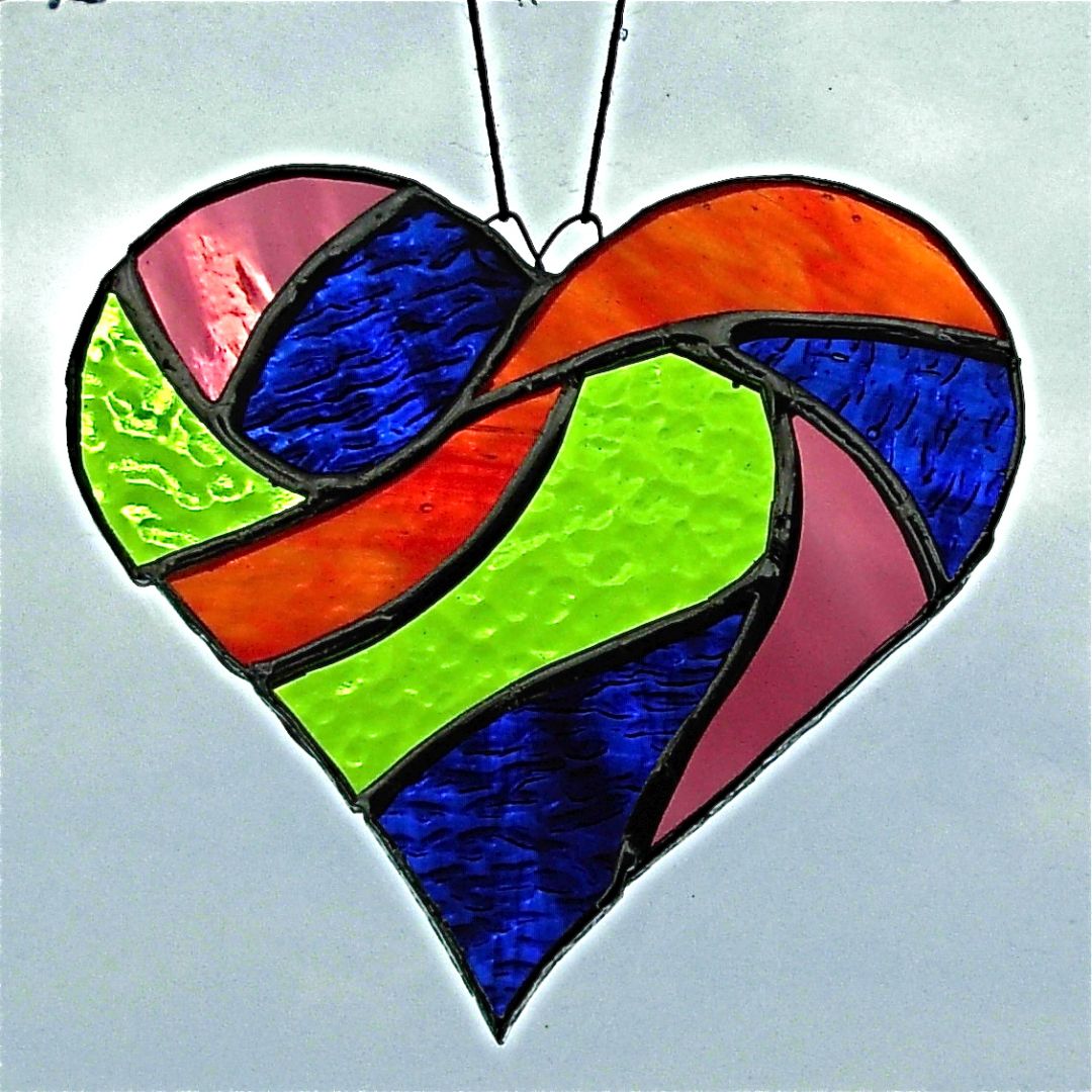
Color is a chameleon. One color can look different depending on what other color surrounds it. It’s like a magic trick, transforming one thing into another. Colors that are opposite from each other on the color wheel are called complementary–red/green, orange/blue and yellow/violet–are particularly intense when side by side, as if they were almost vibrating. For even more fun, there are triads and tetrads. Stratoz was inspired to create his Tetradic Heart after teaching about Chevreul.
My log cabin quilt collage cards from my previous post were an initial experiment with red and green and searching through magazines for color was a revelation. Every page became a palette.
Log Cabin is still one of my favorite designs to work with. Many of my mosaic trivets are variations on the Log Cabin quilt block, and wonderfully suited to playing with contrasting colors, as quilters have known for eons.
What color combinations do you enjoy? If you make things, are there certain colors you gravitate to in your work? I’d love to hear about more color love.
Related:
Over at Stratoz’s Blog:


2 comments