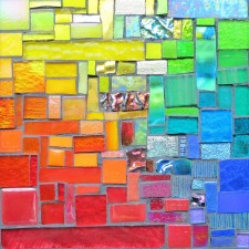
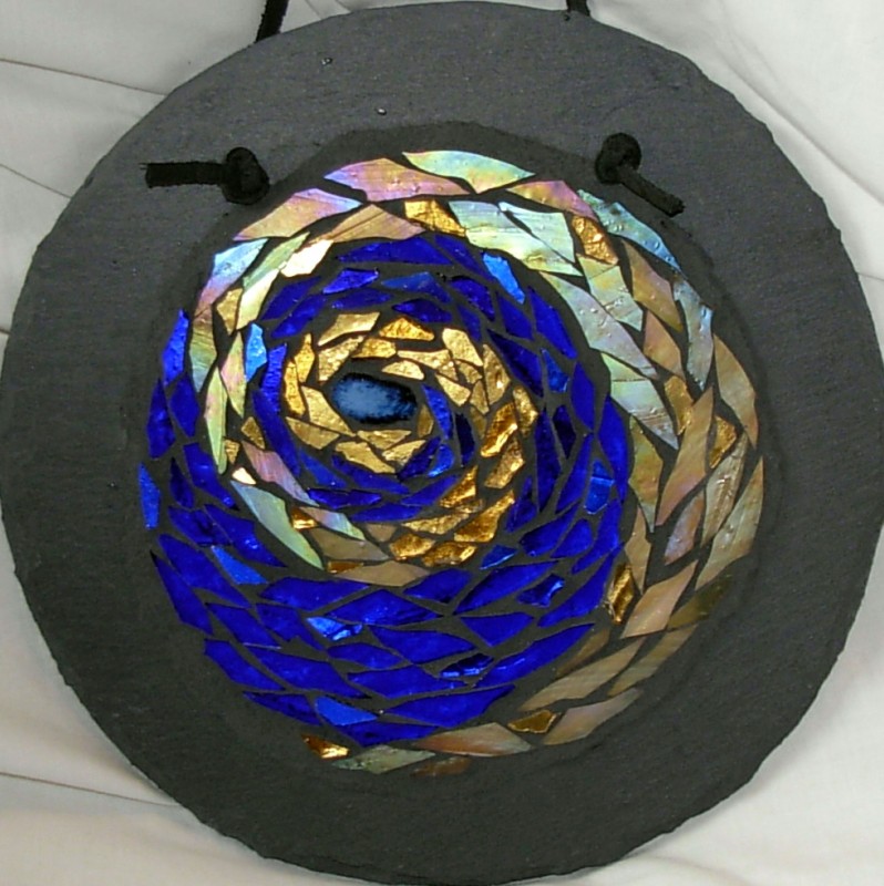
Stratoz’s post about the image of bees being drawn toward flowers by scent made me think of how color can draw the human eye. One of the first explorations I made in the visual arts, after years of being an artist of words, was taking a workshop on color with artist Nita Leland. When I am in the studio, colors send a vibration through me, like the harmony of being in choir, and being surrounded by voices. Two colors that I love together are royal blue and gold. These are very close to being complementary–in color theory pairs of colors which have an affinity to each other are violet and yellow, orange and blue, red and green. The mandala below had an especially compelling pull on my eye, and on Quantum Theology woman as well. I was honored that she purchased it for her prayer space. Art can be a relationship between the maker and the viewer, sweet as honey.
Related: Color Wheel Love


I’ve noticed my response to different color combinations changes over time–about what clashes and what looks beautiful! I remember reading a history of the color blue, and at some point blue was considered a “warm” color,which I thought was interesting.
That makes me very happy–that there is more for you to discover, different things to see in the piece.
They are beautiful! I think of violet and yellow as clashing but you are right that they are stunning here.
..and it still graces my prayer each morning and each night! And much like the psalms I so love, reflects different things each time I look at it.