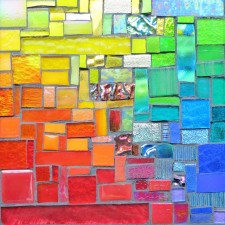
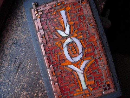
In March of 2011, Stratoz and I received our biggest commission yet. Our friends Gary and Suzanne Halstead had a wall in their yard, overlooking the labyrinth they created. The space was host to retreats and labyrinth walkers, and Suzanne had a vision of the wall mosaiced in the style of our Nutmeg Designs’ signs, in the qualities of the Holy Spirit: Joy, Love, Peace, Patience, Kindness, Goodness, Gentleness, Self-Control and Faithfulness.
We were honored to be asked to create these words in mosaic. I remember being in Sunday School in the 7th grade, at Edmonton Moravian church, and studying the fruits of the spirit, from the passage in Galatians 5:22. In true Sunday School style, the lesson included an exercise in creating a mobile out of paper, a different fruit shape for each quality. Over the course of the week, I felt compelled to recreate the shapes out of scraps of fabric(the 70’s were good for polyester double knit, which didn’t ravel), hand stitched together, and stuffed with cotton batting. Bringing the mobile to class the following Sunday, I felt conspicuous, and felt embarrassed by my excess, and yet I loved the soft forms, and still have them in my memorabilia.
Stratoz began the project by designing and cutting out the letters for Faithfulness. He was going to start with “Joy” but Faithfulness gives us a running start with many more letters! I will be gluing the letters down and mosaicing around them, and I can freely give myself to this big, bold, colorful incarnation of the Fruit of the Spirit, with abandon!
Here is a video by Stratoz introducing Faithfulness:
Over at Stratoz: Scraps of Faithfulness: Doodling


Oh, so lovely. I’d like to see that some day in person. I love the image of you going home to create your own fruits out of polyester. How cute!
I am truly honored to be in creative partnership with Wayne and Margaret on the Fruits of the Spirit commission. Great appreciation goes to Wayne for cutting out all those ‘nesses and the mostly curved letters! Margaret has the patients of a saint to nip & glue all those countless pieces of glass that forms the mosaic around the letters. M&W both do the gluing down on the substrate together. I then take over by creating a border around each word with tiles, glass rounds and shells in colors to blend with each word’s color scheme.
M & I just grouted the first two finished words faithfulness and kindness. She ‘held my hand’ through the process since part of the deal is I would grout all the rest solo! Well, I just did gentleness all by myself ;-). It is quit the process for those who have never attempted it. Believe me – you will appreciate M’s mosaics even more!
This is a beautiful project with wonderful words of inspiration. The font is graceful in design and executed impeccably! I can’t imagine how you cut the even, gentle curves around the serifs of “S”,”t”, and “n”, but they came out great.
Stratoz gets full credit for the font. He draws the pattern pieces, cuts them out and tries not to lose the little tiny pieces inside the glass grinder!