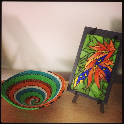
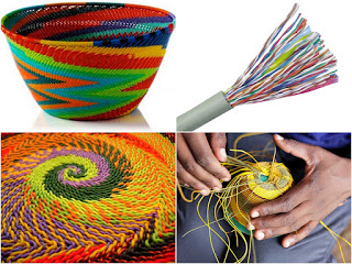
Zulu Telephone Wire Basket and Nutmeg Designs Mosaic.
My sister brought me Zulu telephone wire baskets from South Africa, and I was mesmerized by the intense colors. Zulu weavers traditionally used palm fibers with subtle colors for vessels to store food and beer. According to Anitra Nettleton, men who migrated to the cities as night watchmen began using telephone wire to weave in brighter colors. Now the Fair Trade cooperatives that create these baskets buy plastic coated wire directly from suppliers, who have added more colors.
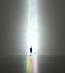
Tokujin Yoshioka: Rainbow Church @ spectrum via mikha_elohim on FlickrYoshioka’s 吉岡徳仁 “Crystalize”展_Rainbow Church via Takahiro Shutoh on FlickrTokujin Yoshioka: Rainbow Church @ spectrum via mikha_elohim on Flickr
Tokujin Yoshioka constructed a church of color and light 40 feet tall with 500 crystal prisms as the Museum of Contemporary Art Tokyo. According to his press release, he was inspired by a chapel designed by Matisse:
It was inspired when the young Yoshioka visited the Chappelle du Rosaire,
a chapel designed by Henri Matisse in his last years, and was struck by the beauty of its light.
The sunlight of the Provence pouring in through the beautiful stained glass,
created in the vivid colors so characteristic of Matisse’s paintings, created a space suffused with Matisse’s colors. There Yoshioka was seized by an ambition to construct a space of his own in which to experience light through all the senses. This large-scale installation presents that light, which has always been one of his ultimate goals.
To envelope you in colored light is one of the magical powers of stained glass, and Tokujin Yoshioka finds his own way to release color.
Xanthocyanopia is a form of color blindness where only yellow and blue are perceived. As a child I used to wonder if other people saw the same colors in the same way, and how would we know.
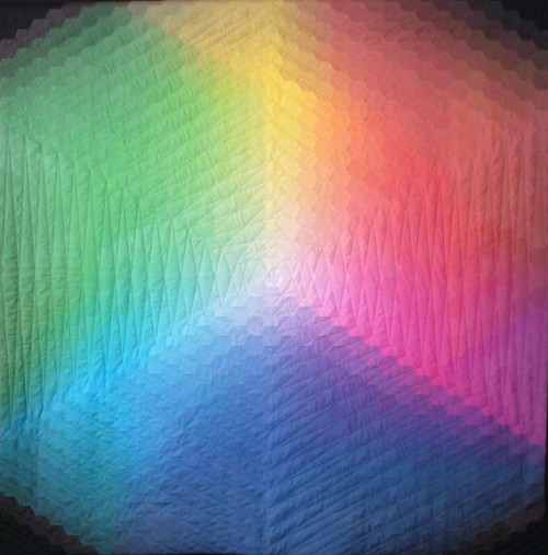
This is color play at its most exquisite. Kathy K. Wylie created this quilt for a competition with the theme of color. She wanted to create a color wheel using hexagons, but finding enough fabric to do all the gradations of hue was a challenge. I love her solution of printing the hexagons onto fabric sheets, using the power of the computer to mix colors. Wylie started with cyan, magenta, and yellow, the classic three colors of digital printing, and named the quilt Trinity in their honor.
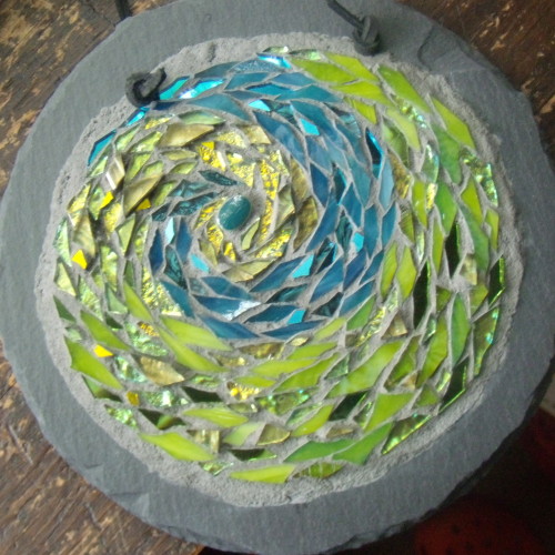
Earth Spiral Mandala by Margaret Almon, glass, ceramic, gold smalti, on slate, 7 inches.
Virescent is like a mixture of two of my favorite words, iridescent and verdant. Virescent describes becoming green, a word of spring. The way yellow turns into green is one of my favorite transitions when I am making mosaics.
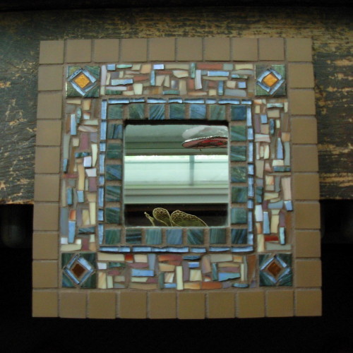
Umber and Blue Mirror by Margaret Almon, glass, copper smalti, and unglazed ceramic tile, 10×10 inches.
Umber is an earthtone, an earth pigment. It’s odd how I can hear the names of “raw umber” and “burnt umber” and not realize it meant that one was in its “raw” state, and the other heated, to make a deeper tone. The outer tiles are Cinca unglazed ceramic from Portugal, and seem formed right out of the earth.
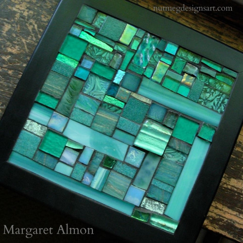
Teal Trivet for Ovarian Cancer Awareness 2013 by Margaret Almon
A tint is created by adding white to a color to make it lighter. Some stained glass is made with white glass swirled into the color, making a particularly apt tint. With this trivet, I worked with the whole family of teal tints.
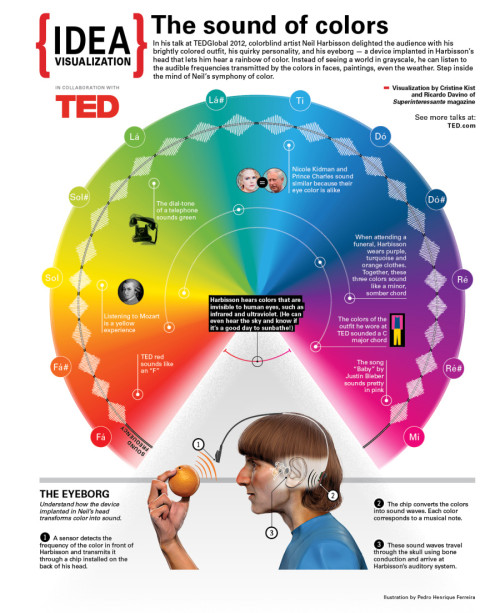
The Sound of Color: Neil Harbisson Visualized. Infographic by Cristine Kist and Ricardo Davino of Superinteressante magazine.
Stratoz forwarded this TED talk by Neil Harbission, an artist who is completely colorblind. He created a way to translate colors into sounds, and the colors became such a part of him that he started dreaming in color.
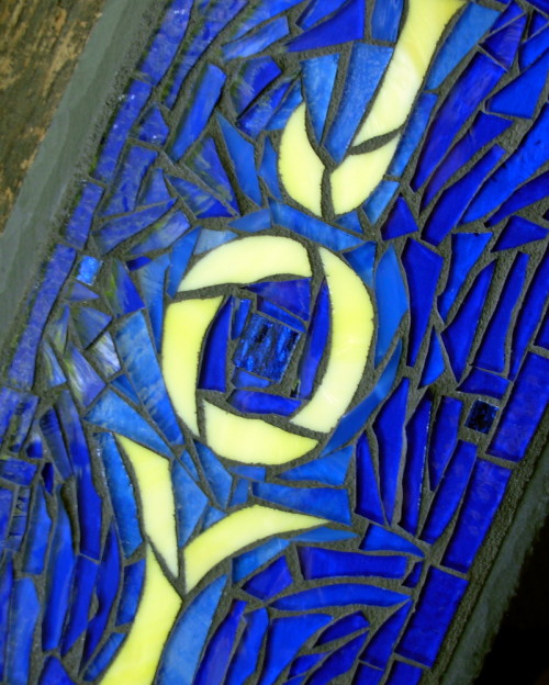
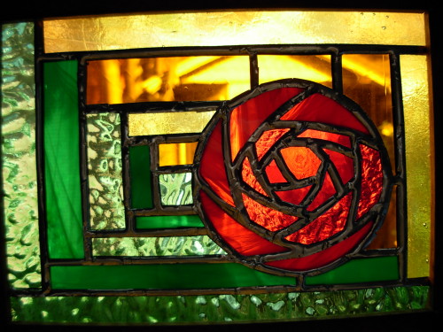
Mackintosh Rose Log Cabin Stained Glass by Wayne Stratz.
Looking for an R for the A to Z challenge, I discovered rutilant: glowing or glittering with red or golden light. This stained glass piece by Stratoz captures both red and golden. I love finding a new word that has relevance to the art around me.
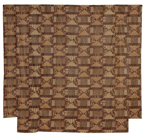
Summer Chintz Spread(circa 1830)from the Rocky Mountain Quilt Museum
When I think of drab, I think of dull, but it actually refers to a color scheme made from quercitron dye, which includes shades of yellow, brown, orange and green. Quercitron was derived from the yellow inner bark of the black oak tree, and an Englishman observed the process in the US in 1785 and took out a patent in Britain, naming it after Quercus(oak) and Citrina(yellow). The type of mordent used to fix the quercitron dye produced the array of colors.