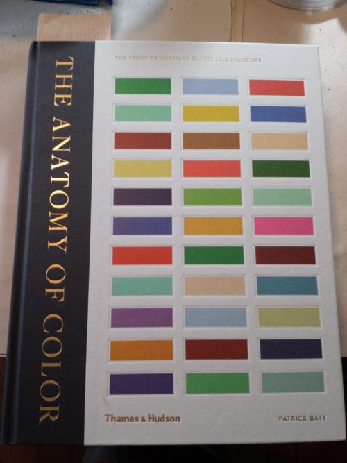
Color energizes me and my art. I bought The Anatomy of Color by Patrick Baty as a Christmas gift to myself. The historic color charts are amazing and if you have pinned a color wheel photo on Pinterest it probably came from this book. Follow the author at @anatomyofcolour on Instagram to see more!
I have a compelling desire to create rainbows. I have made many of them in mosaic. Once a woman came into my craft show booth and was smitten with one of my rainbow panels, but said she couldn’t buy it because her husband would be affronted by the gay implications, and gave an awkward shrug. This made me both sad and angry.
With the Supreme Court ruling about marriage and gay folk in June, 2015, there is an abundance of rainbows appearing on my Facebook stream, and it’s outburst of talking my rainbow language, and to me this ruling good news, just as God’s love is good news.
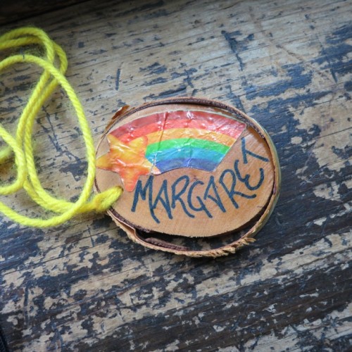
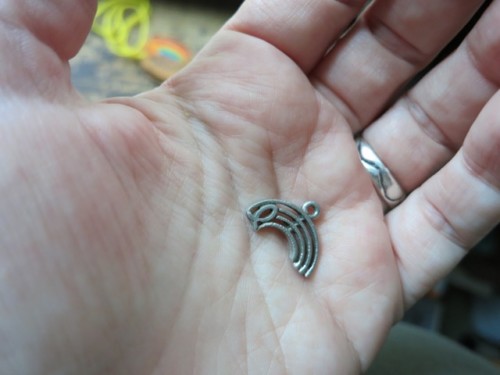
Rainbow Nametag from Junior High Church Camp, circa 1982.
My love of rainbows began at Moravian Church Camp Van Es at Cooking Lake in Alberta. The theme in 1982 was The Rainbow Connection. We each had a slice a log, and a volunteer had applied rainbows and written our names. We watched The Muppet Movie with the theme song The Rainbow Connection, and learned the to sing it. We painted a large rainbow backdrop, in an open area in the woods.
We memorized Bible verses about the rainbow as a symbol of God’s promise to never again cover the earth in a great flood, a sign of God’s love. What gave it power was the idea that this love extended to me, though I felt flawed through my core, cracked with no method of repair. True grace is a very difficult thing to accept, because the bruised soul assumes it applies to everyone else except her.
The Rainbow Connection
I took the idea of hope and love to heart. I bought a pewter pendant cast in the form of a rainbow and embedded with an Ichthys fish(a visual pun, an acronym of the Greek letters spelling out Jesus Son of God, which also meant fish). I wore it often, as a way to remain hopeful.
Now, some 30 years later, I look at it and wonder at the grayness of this rainbow, and no wonder I feel compelled to create them in full color. For a girl of 14, coming out of a year of depression, the colors were intense. There is power in symbols, but also the power of color itself, the incarnation of beauty.
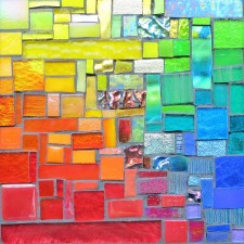
Out of the Crayon Box by Rachel Clark. Pennsylvania National Quilt Extravaganza 2014. Photo by Wayne Stratz.
I just love color and when I say I love color it’s not about that I just love bright colors. I just love color. I’ve had a really fun time in the last year, two years, working with beige and just exploring and playing around with the properties in the colors of beige, the different beiges, so I just like colors and so I tend to work with a lot of colors.
Stratoz and I satiated our quilt sense at the Pennsylvania National Quilt Extravaganza 2014. This special exhibit, out of the Crayon Box, by Rachel Clark was like a dream closet, a space of color clothing the body and soul. That last phrase is her tagline and it is wonderful. The opening quote is from an interview with Rachel Clark, and she articulated something that I have experienced – a love of color, not just bright colors. I love playing with colors in all their forms.
I have been on Instagram since 2013, and I started to notice photos matching objects to Pantone Color Postcards. This is the only card game I would enjoy playing. I ordered the box of 100 Pantone Postcards awhile ago, because I couldn’t resist a box of color, but I couldn’t bring myself to actually send them through the mail. The Pantone Project, as it is called, gives me a use for my cards. There is something satisfying about finding something that matches a card, or in finding the right card to match something that has caught my eye. Of course I started with orange!
In reading about the history of this project, I discovered the artist who began it, Paul Octavious.
Surprise, Surprise(2003) by Tim Bavington. Albright-Knox Gallery, Buffalo, NY. Photo by Wayne Stratz.
I wanted to revisit the Albright-Knox Gallery which I thought I saw in 2007, but it didn’t look familiar at all. Fortunately, it was a place worth visiting for the first time. This painting is Tim Bavington’s translation into color from the structure of the guitar solo in the Rolling Stones’ tune Surprise, Surprise. The artist creates connection between musical notes and the color wheel. Stratoz took this photo at an angle to the painting, and the yellow-orange seems to turn to the camera and stare directly into the lense.
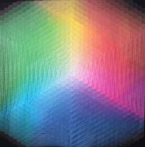
This is color play at its most exquisite. Kathy K. Wylie created this quilt for a competition with the theme of color. She wanted to create a color wheel using hexagons, but finding enough fabric to do all the gradations of hue was a challenge. I love her solution of printing the hexagons onto fabric sheets, using the power of the computer to mix colors. Wylie started with cyan, magenta, and yellow, the classic three colors of digital printing, and named the quilt Trinity in their honor.
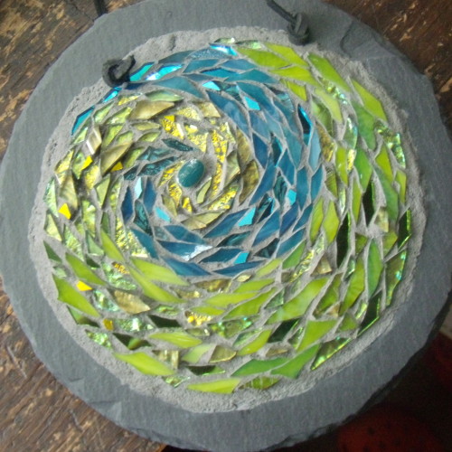
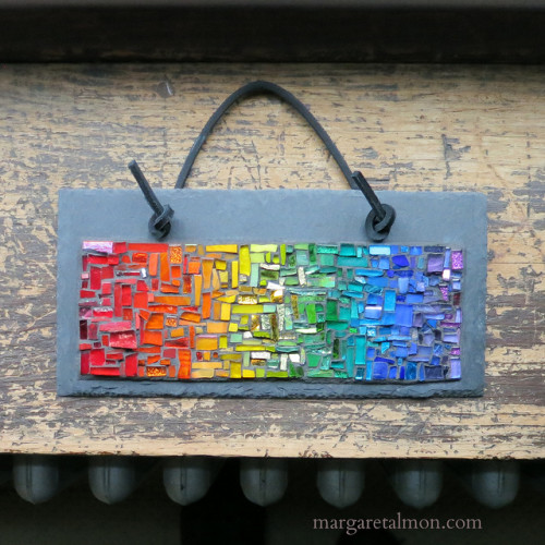
Earth Spiral Mandala by Margaret Almon, glass, ceramic, gold smalti, on slate, 7 inches.
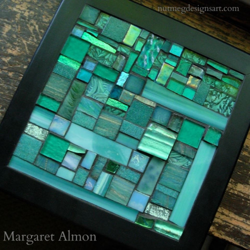
Virescent is like a mixture of two of my favorite words, iridescent and verdant. Virescent describes becoming green, a word of spring. The way yellow turns into green is one of my favorite transitions when I am making mosaics.
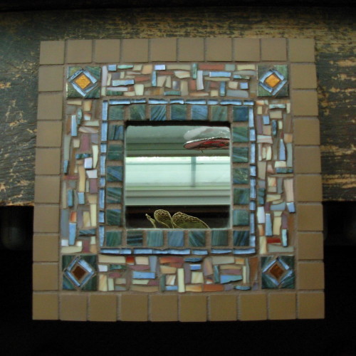
Umber and Blue Mirror by Margaret Almon, glass, copper smalti, and unglazed ceramic tile, 10×10 inches.
Umber is an earthtone, an earth pigment. It’s odd how I can hear the names of “raw umber” and “burnt umber” and not realize it meant that one was in its “raw” state, and the other heated, to make a deeper tone. The outer tiles are Cinca unglazed ceramic from Portugal, and seem formed right out of the earth.
Teal Trivet for Ovarian Cancer Awareness 2013 by Margaret Almon
A tint is created by adding white to a color to make it lighter. Some stained glass is made with white glass swirled into the color, making a particularly apt tint. With this trivet, I worked with the whole family of teal tints.
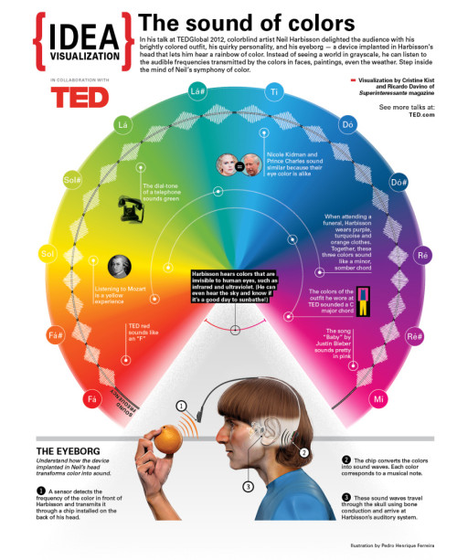
The Sound of Color: Neil Harbisson Visualized. Infographic by Cristine Kist and Ricardo Davino of Superinteressante magazine.
Stratoz forwarded this TED talk by Neil Harbission, an artist who is completely colorblind. He created a way to translate colors into sounds, and the colors became such a part of him that he started dreaming in color.


 by Tim Bavington")