Margaret O’Rorke describes sitting in her garden and showing a friend a vessel she had made, holding it up to the light, and being struck by the beauty of the translucence, and wanting to pursue this quality in porcelain. It’s a process of learning from each piece, because you don’t know how the light will come through it until the piece is finished. She hopes the feeling in her hands when she moves the clay will be felt by those who encounter her work, and share in the pleasure she receives from the clay.
Margaret O’Rorke. Photo by Alberto Ferrero.
O’Rorke began as a painter, and then became a potter. In 1992, she spent several months with Japanese potter Koie Ryoji and was influenced by his inventiveness, as her amazing clay lights demonstrate. Her manipulation of the porcelain clay reminds of Stratoz when he’s stretching dough for his grandmother’s strudel recipe, stretching it until light passes through. I love how O’Rorke has taken her revelation and had adventures with it, learning a whole process of making functional lighting, as well as invoking wonder with her translucent creations.
Margaret Armstrong(1867-1944), designed over 270 book covers during her career. I am drawn to her swirling designs, detailed flowers, and love of gold and silver imprinting, and deep rich binding colors. She and a group of female friends traveled around the western states from 1911-1914, and took a trip to the bottom of the Grand Canyon(the first white women to do so), and went on to write and illustrate Field Book to Western Wildflowers. (Printed Flower Gardens)
I was interested to discover, since Stratoz makes stained glass, that Armstrong’s father was a well-known stained glass artist who worked with Tiffany, Maitland Armstrong, along with Margaret’s sister Helen Armstrong, using a technique of “plating” where glass is stacked in order to modulate the light. I also covet her monogram, since it is the same letters of my own, and I love the interlocking type.
“She started a vogue for making the book covers themselves artistic and distinctive, and her covers became a sort of identity tag for the author. Whenever I see the dark blue and gold design on the spine of some book on a library shelf I have recognized it as Henry van Dyke’s even before Margaret’s distinctive lettering tells me so.”
How to Know the Wildflowers. Cover by Margaret Armstrong.
Tent on the Beach. Cover by Margaret Armstrong
Love finds the way. Cover by Margaret Armstrong
Days Off. Cover by Margaret Armstrong.
Pippa Passes. Cover by Margaret Armstrong.
Sleepy Hollow. Cover by Margaret Armstrong.
How to Know the Ferns. Cover by Margaret Armstrong.
The Dragon of Ignorance by Hildreth Meiere, 1939 New York World’s Fair Medicine and Public Health Building. Hippocrates was shown battling the Dragon. Photo by Wayne Stratz. .
Phillip Lloyd Powell (1919-2008), Door and Surround, ca. 1967, stacked carved softwoods, polychromed, H. 11’10” x W. 5’6 1/2″ x D. 1’6″ inches, James A. Michener Art Museum. Purchased with funds provided by Syd and Sharon Martin
Imagine coming upon this door! What world of the imagination did it come from and were does it lead? Stratoz and I were at the James A. Michener Art Museum in Doylestown, PA, and amid the Pennsylvania Impressionist paintings we saw Phillip Lloyd Powell’s Door and Surround. I sat down on a bench to take it in, the beauty of the layers of wood, the warm colors, the vibrant portal over 11 feet tall.
After the Michener purchased the door at auction, furniture conservator, Behrooz Salimnejad, spent months restoring the original vibrant finish, removing layers of latex paint that obliterated the colors. Phillip Lloyd Powell(1919-2008), was a self-taught woodworker who read an article about an artist in New Hope, photographed in front of a wall of books, and wanted that life, and moved there, and set up shop. I admire his focus on creating the life he wanted, and the work that came from that life.
I was drawn to woodworking at age 9 or 10. I wanted a tool set for my birthday. I spent many hours dreaming about what I would make, especially with the chisels. I wanted to sculpt blocks of wood. I don’t know where this came from, this intense desire to have tools. I did get the tool set for my birthday, much to my delight. The box was a golden yellow shade, with the grain of the wood in wavy pattern. The tools had red handles, and fit behind dowels to hold them steady. There were two chisels, but I was disappointed that I had no idea how to create what I was imagining.
I started researching where my tool set might have come from. There’s no label, no brand name. I did find the word “Poland” faintly stamped on the inside, and this led to the “Handy Andy” Tool Sets for children, or more accurately, for boys. As an ad admonishes, “Keep away from Dad! He’ll want to use this too. . .well rounded assortment to help train boys in the correct use of practical tools. ” I don’t remember seeing a label on my set, and didn’t contend with the image of Andy, and his boyish ease with all the fabulous tools. I also didn’t need to keep them away from my father, who was a professor of English, with a wall full of books of his own, but he did stand next to me in the garage supervising me with the sharp implements, as I constructed a dollhouse. This wasn’t what I originally intended, but I slowly warmed to the decoration of the rooms, creating furniture out of scraps of wood, papering the walls with wallpaper samples.
I’ve kept the box of tools over 30 years. I loved the hand plane, skating across the wood. The spirit level mesmerized me with the bubble in glowing green liquid. I took the tool set down from the attic, and put it in my mosaic studio, an homage to my desire to work with my hands, to make things. Phillip Lloyd Powell’s door reminded me of my dreams of chisels and sculpting, and I came across an interview describing his process:
His materials are meant to provoke sensation. He selects woods, colors, and accent elements for their expression.
Powell also considers malleability. He finds walnut, which is softer than maple or oak, fun to shape with his favorite tool, the spoke shave (a side-handled plane for curves) which requires a sculptor’s skill.
The furniture parts are fitted together by spline and rabbit joints, dovetails and butterfly inserts. The wood and colors of the pegs are important to the design. Finally, several coats of oil will bring up the rich grain and color of the wood.
So he loved a plane too, and even the name appeals to me, the “spoke shave.” I have tools for my mosaic work, tools that I know how to use, and with which I can create.
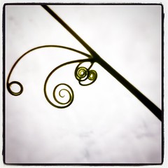
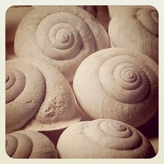
Gourd Tendrils by Lynn Lunger of UnaOddWoodland Snail Shells by Lynn Lunger of UnaOdd
Lynn of UnaOdd posted this photo of gourd tendrils, and I was happy to introduce her the wonderful word volute which happens to be one of my favorite forms. I first found the name for the swirls I gravitate toward in a book by Franklin Gottshall, Design for the Craftsman, and in my craft geekiness was giddy to know this shape has a name. It’s from the Latin voluta, meaning spiral scroll. I am enjoying Lynn’s Woodland Snail shell volutes now.
Volutes via Tagote on Flicker
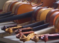
Not to mention the ironwork volutes I saw attached to Violin in the Sky, and the scroll that crowns the violin itself.
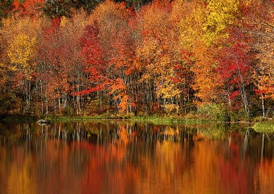
Peak Color by Paul Grecian, Archival Pigment Photograph
A Sense of Place
featuring: Paul Grecian and Materese Roche
Artists’ Gallery, Lambertville, NJ
This show runs from August 5, 2011 until September 4, 2011
Stratoz and I had the pleasure of attending the opening of A Sense of Place, featuring the work of our friend, photographer Paul Grecian, and landscape paintings by Materese Roche. The show is framed by Thoreau’s assertion that “The question is not what you look at, but what you see.” The opening featured the unveiling of two works that Paul and Materese created from the same unedited photo file, independently of each other, and I was fascinated by how different the two pieces were, as each was marked by what the artist saw, their vision of the world around us. Vision can be both the biological ability to see, and a larger interpretation and passion within that seeing.
I am drawn to Paul’s use of color, his sensitivity to the power that resides in focal points of a scene. His landscapes are intentional, as he focuses on the places in a scene that harbor the most energy. Stratoz and I have one of Paul’s photos, cedar waxwings feasting on berries, sculptural in their dimensionality in the foreground, and a background that seems constructed of painted silk, of shades of green and dark red. A Sense of Place highlights the artist’s reverence for nature, his explorations of local natural areas like Peace Valley Park in Bucks County, PA, as well as the coast of Maine, with gorgeous orange enlivening the images.
This was our first visit to Artists’ Gallery in Lambertville, NJ, and the array of work is wonderful, as is the commitment to artists:
Artists’ Gallery is a partnership of professional visual artists who cooperatively administer, staff and exhibit in our Lambertville, New Jersey location. . . Since its inception in 1995, the high quality of work and variety of artistic styles has earned Artists’ Gallery a solid reputation among discerning collectors, designers and art critics as a showcase for viewing and purchasing original works of art.
Artists’ Gallery is committed to a $0 profit policy. Each member gets 100% of proceeds from the sale of his/her work.
Passing Storm by Materese Roche, oil on Linen
Work by the other 16 artists in the cooperative was also on display and I was particularly taken by the wood mosaic of Norine Kevolic with a natural and painted wood, mica powder, metal leaf, each individually scribed and cut on a bandsaw.
Ecstatic Landscape is an apt description for this show, which features Peter Kinney, Helen Mirkil and Susan Pasquarelli and their engagement with nature, and expression of that relationship in found earth, watercolor and oil. This was my opportunity to see more work by Helen Mirkil, after her Hidden Stories show at the Montgomery County Community College Gallery. Footbridge held me with the colors, the pale violet blue sky with flashes of red, the streaks of regenerative green blue, and the footbridge emerging from the scratched lines, the human desire for connection, and passage over water.
Spring Step by Helen Mirkil
In Spring Step, the trees mediate the sky, reaching up with their limbs, in a kind of prayer. The red orange center trunk is the heart of the painting for me, a nourishing color, and then the vibration of the dark red, blossoming into green, unfolding renewal. The color evokes what I love about the use of color in Fern Coppedge’s work, and the vocabulary of red violet, of the life blood of contemplation in nature.
Moon Boat Mandala by Peter Kinney
As I had walked into the Borowsky Gallery, I saw the sign asking me to be mindful of the floor sculpture, and had the unexpected sight of a mandala directly in my path on the polished wood floor. Peter Kinney‘s Moon Boat Mandala is a distillation of fabulous ephemera, from sand, iridescent shell, seed pods, to the ladder of feathers leading into the glittering black, and the orange spine of the top feather making a joyful gesture of color.
Moon Boat Mandala Detail by Peter Kinney
Susan Pasquarelli‘s series of Mountain Contours start with the shape of specific mountain ranges, and merge into gradations of color and her spiritual regeneration through gradual change. She describes her vision of art as a part of the process of nature. I wanted to be in the midst of these mountains, where the colors gradate into light at their center.
Ecstatic Landscape runs until Sunday August 14th, 2011, at the Borowsky Gallery in the Gershman Y, 401 South Broad St., Philadelphia, PA.